![]()
![]()
![]()
![]()
![]()
![]()
![]()
![]()
![]()
![]()
![]()
![]()
![]()
![]()
![]()
Marcia Strassman Ron Palillo Gabe Kaplan Welcome Back Kotter 1977
Medium: Grayscale Photograph
By: ABC Television
Edits: Photoshop edits by Tom HolmesThis work is in the public domain in the United States because it was published in the United States between 1927 and 1977, inclusive, without a copyright notice. For further explanation, see Commons:Hirtle chart as well as a detailed definition of "publication" for public art. Note that it may still be copyrighted in jurisdictions that do not apply the rule of the shorter term for US works (depending on the date of the author's death), such as Canada (50 p.m.a.), Mainland China (50 p.m.a., not Hong Kong or Macao), Germany (70 p.m.a.), Mexico (100 p.m.a.), Switzerland (70 p.m.a.), and other countries with individual treaties.

Title: Dinosaur in Bloom
Medium: Color Photograph
By: Tom Holmes
I first noticed the dinosaur in the tree in my front yard on Friday, March 20, 2020. I had been living in the new home since mid-August 2019, but this was the first day I noticed the creature from Mesozoic Era. This tiny dinosaur disappears every spring, and in the fall, in October or November, after the leaves have fallen from the tree, this perennial dinosaur blooms.
Title: Kerouac Listening Through the Static
Medium: Oil on Canvas. 24" x 18".
By: Scott Poole
This painting is part of a series Im doing on people who have influenced me. It includes politicians, poets, writers, psychologists, philosophers, artists, and exceptional humans in many areas. The source for this painting is a black and white photograph by John Cohen: Jack Kerouac Listening to Himself on the Radio, 1959. Since it was in black and white, I had to guess the color. I knew Jack was white, so that was easy. For the radio, I looked up 50s era radios and even found one that looked like the one in the picture. In the end, I decided to go with a 50s Chevy baby-blue to counter the orange in the face and also to tip my hat to On the Road.
Title: Bill in the Department of Rare Books and Special Collections
Medium: Photograph
Date: March 4, 2017
By: Roy Hartwell Bent
William Heyen is in the room that houses the William and Hannelore Heyen Collection in the Department of Rare Books and Special Collections at the University of Rochester, and he is about to make remarks about the collection to the members of Just Poets, Inc.
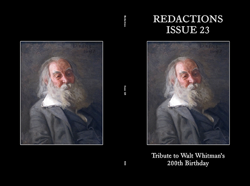
Title: Portrait of Walt Whitman
Medium: Oil on Canvas (30 1/8 x 24 1/4 in.)
Date: 1887-88
By: Thomas Eakins
The work of art itself is in the public domain for the following reason: The author died in 1916, so this work is in the public domain in its country of origin and other countries and areas where the copyright term is the author's life plus 100 years or less.
Title: Camel Mountain
Medium: A black and white surreal photo-manipulation
Date: July 1, 2015
By: Sarah DeRemer
This file is licensed under the Creative Commons Attribution-Share Alike 4.0 International license.
https://commons.wikimedia.org/wiki/File:Camel_Mountains.jpg
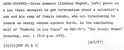
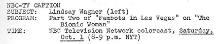
This work is in the public domain because it was published in the United States between 1923 and 1977 and without a copyright notice. commons.wikimedia.org/wiki/File:Lindsay_Wagner_Bionic_Woman_1977.jpg.
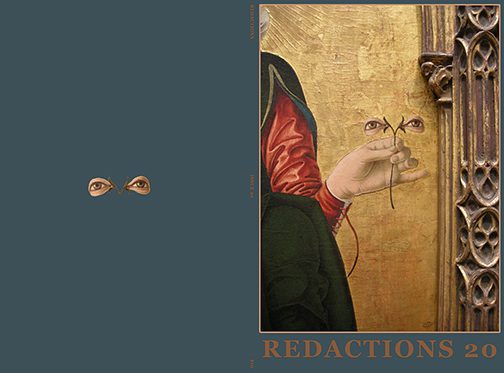
Francesco del Cossa, santa lucia, dal polittico griffoni, 1472-73 dettaglio by Sailko.
This picture is free for use: https://commons.wikimedia.org/wiki/File:Francesco_del_Cossa,_santa_lucia,_dal_polittico_griffoni,_1472-73_dettaglio_01.JPG.
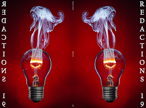
Cover Art and Artist: The tungsten filament burning with a flame in the light bulb by Stefan Krause.
The glass bulb of the lightbulb has been opened, causing the inert gas inside to escape. When turned on, the tungsten filament burns with a flame, due to oxygen entering the light bulb. The light bulb was screwed into a socket, which was replaced with the lamp base using image processing.
This picture is free for use: http://commons.wikimedia.org/wiki/File:Gl%C3%BChwendel_brennt_durch.jpg#file.
April Coppini was born and raised in a wooded suburb of Rochester, New York. She attended the University of the Arts in Philadelphia in 1990 and Alfred University, School of the Arts from 1991-1994. She received her BFA from Alfred in printmaking and drawing and moved to Portland, Oregon in 1995. April works at her home studio in NE Portland where she lives with her family and finds inspiration from her three children, their eleven chickens, two cats, and (the best ever) dog, Duke. When she is not working, she spends time watching her children, fussing over the chickens, computer stalking other artists, and running with Duke. Her work in the past few years has been a vague effort to record something wild and unseen about the form of animals; movement, life, the space between things. Shortly after hearing about the rapid disappearance of honey bees in our country (termed colony collapse disorder), she imagined a series of bee drawings. Displayed in the same erratic way that bees fly about, and conveying something of their importance or intrinsic value, her hope was that my effort to create these bees, would, in some way create more actual bees in the world.
About the Cover Art
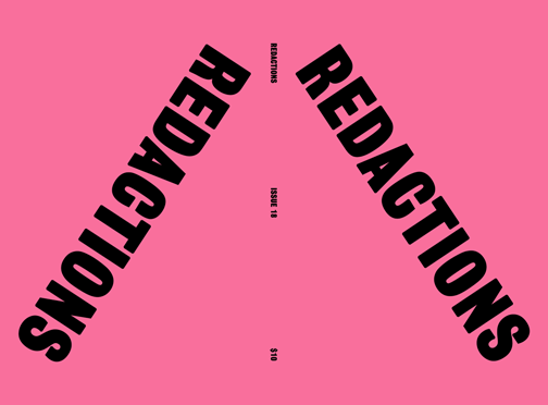
The cover for Redactions issue 18 is based on the cover to the first issue of BLAST, a magenta-colored covered and oversized (approximately 9" x 12") literary and art journal. Thats it. A magenta-colored cover with BLAST at an asymmetrical angle across the cover. Simple but shocking. Revolutionary.
For Redactions, the angle has been made symmetrical.
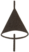
About the Vortex
The Vortex symbol that appears on page 48 and 75 is a symbol of Vorticism and its energy. It appears in Redactions issue 18 as a tribute. It was scanned directly out of BLAST, where it first appears on page 9 the introductory page to the Vorticism Manifesto. This cone may also have been designed by Wyndham Lewis or he may have just found a printers block. Nonetheless, as William C. Wees points out in Vorticism and the English Avant Garde (1972): At strategic points in the magazine, Lewis printed the Vorticists Vortex [cone]. The image seemed so right, suddenly [. . .], defining the quintessence of Blast and the movement it represented. David Wagg in Wyndham Lewiss Vorticism and the Aesthetics of Closure (in Steve Giles Theorizing Modernisms: Essays in Critical Theory, 2002) points out: If the Vorticist symbol of the cone, point upwards, signifies a transcendental consciousness capable of mastering contingency through art, it is equally obvious that the above formulations are paradoxical through and through, since the Vorticist production of artworks, and hence Vorticist consciousness, is somehow brought forth by the very contingency it seeks to control.
It is used in this issue of Redactions as bookends to the BLAST tribute section.
COLOPHON
The typeface used throughout Redactions issue 18 is Grotesque No. 9. It is the same font that was used in BLAST. It was developed by Blake Stephenson, and rumor has it, with help from Wyndham Lewis. Stephenson developed a series of these Grotesque fonts in order to create a clean, straight-forward, and non-decorative series of sans serif typeface. As Tyrone Hopes points out in BLAST: The Explosion of Modernism, The printed word was then the king of communication, and Lewis conveyed these vivid and violent ideas with an unconventional typographic presentation, using a new font called, appropriately, Grotesque. It was a popular style in advertising. If advertising and literature seem contradictory impulses to you, they did to Charles Sumner, too, a point which he addresses in his essay Blast and Commodity Culture (68). In its use, Grotesque No. 9 is bold, straight, clean, and impactful. Its a solid form of energy, like an Henri Gaudier-Brzeska sculpture.
Editor's note
One hundred years ago on July 2, 1914, BLAST, or what Ezra Pound called the great MAGENTA coverd opusculus, was released into the world. There are arguments about the actual release date, as it was to be released on June 20 (as is indicated on BLAST page 1), but through financial difficulties and other issues, its appearance was delayed. Whenever it did arrive into the world, BLAST changed literature and literary publishing.
It changed literature as it introduced Vorticism to the public. Vorticism is difficult to pin down with a definition, but I like to call it art with a high energy discharge. Tyrone Hopes gives a very good overview of BLAST and Vorticism in his essay BLAST: The Explosion of Modernism (50). If you want to think of Modernism, especially early Modernism, as an explosion of isms, Vorticism is one of the first significant isms.
BLAST also changed literary publishing with its bold cover and typeface, Grotesque No. 9, which I discuss in the colophon on page 83. BLAST made literature come alive on the page and the cover. It was vibrant! Even decades later, its vibrancy is still catching, as rock-star legend David Bowie has BLAST on his Top 100 Must Read Books.
The BLAST tribute section, while only 28 pages in length, is substantial in its remembrance of BLAST and Vorticism. This is accomplished with contemporary Vorticist poems, including the first ever Vorticist sestina What Remains by David Lloyd. To be sure, Pound also wrote the sestina Sestina: Altaforte, but that was before BLAST and Vorticism. The BLAST/Vorticist remembrance is also achieved through short essays, such as Mark Antliffs piece about Henri Gaudier-Brzeska (that Savage Messiah sculptor who changed my life and who sculpted the phallic Hieratic Head of Ezra Pound), Charles Sumners examination of Blast and Commodity Culture, as well as a personal remembrance by Scott Klein. Both Scott Klein and Mark Antliff are also responsible for the recently released Vorticism: New Perspectives (Oxford University Press, 2013). If this tribute excites you, please turn to that book to continue the energies.
You will notice this issue has no creative prose. For the next issue, we do seek short fiction and creative non-fiction pieces. We also would like to receive more submissions from women and people of color.
Long Live the Vortex!
Find Beauty,
Tom Holmes, Editor
M F Macpherson, Prose Editor
Title: Balor
Medium: Digital collage.
Balor arose from studying early Irish myth the terrifying image of Balor, with his murderous eye, gets translated into circles that reverberate. Rose windows, Cuchulains hound, knots. Again Im interested in ambiguity in these images in my mind, this is what creates the spark that Breton was after in his Surrealist manifestos.
EDWARD SCHELB has pursued the intersection of poetry and painting both as an artist and a critic. He has recently published essays on John Yau and postmodern art, and his graphic poem Angelic Meltdown is a strange and unholy admixture of rockabilly, Rimbaud, and pop Art.
Editor's note
This issue of Redactions: Poetry, Poetics, and Prose is right on track for my hopes and desires for the journal an eclectic selection of written aesthetics as well as writings that try to risk something or do something new. In this issue, you will encounter the experimental scherzo from William Heyen, the experimental and exploratory Chronic vs Terminal poem from Jennifer Bradpiece, the wildness of James Grabill, the literary yet playful poetry in Anthony Frames Everything I Know I Learned from The Dream Songs, the political but not overbearing To the Representative on the House Science, Space, and Technology Committee, Who in 2012 Said, Evolution, Big Bang Theory, All That Is Lies Straight From the Pit of Hell, I Offer This Quick Study on Natural Selection, in Which the Eagle is Thought; the River is Reason; the Salmon is Insight; Tomorrow is A Salmon; and the Crows, of Course, Are You poem by Rob Carney (not to mention the crazy, long title), the heart-breaking and well-crafted Surgery poem by Donald Illich, and Nathan E. Whites memoir-esque and literary criticism-esque Further Reading: DistanceModulus. All in all, there is lot of exciting writing in here, and there are certainly many pieces that will appeal to everyone. The next issue of Redactions will be a tribute to BLAST that great MAGENTA coverd opusculus of the Vorticists. July 2, 2014, will be the 100th anniversary of this seminal literary journal that changed the complexion of literary journals. For that issue, we will be looking for poems or stories written in the Vorticist style, or poems or short essays (under 1000 words and closer to 500 words) about something that fascinates you about Vorticism, a Vorticist, or BLAST. See complete submission details at Submissions & Ordering.
For now, enjoy issue 17 of Redactions: Poetry, Poetics, & Prose.
Find Beauty,
Tom Holmes, Editor
M F Macpherson, Prose Editor
Its a long journey ahead, treading through the deserts of the Silk Road, reaching out to all directions. For thousands of years, China herself has walked a long way towards the world through this corridor. The only time when you and I, modern as we are, could sense the loneliness of the Silk Road is during the late hours of a chilly night in January. Only then, few people will be found on this endless road. Only then, you will find those who would share their soul and a toast with you, and continue the million-mile journey with you to wherever. Only then will you feel like you are on the ancient Silk Road.
CHRIS LEUNG is an amateur travel photographer. Based in Hong Kong, he travelled a lot in some remote parts of Asia, such as Iran, Laos, Tibet, as well as Yemen, to capture the unseen scenery of these forgotten lands. He holds an MSc in New Media from the Chinese University of Hong Kong. His first sole photo exhibition The Worlds Colour was held in Seattle, U. S., on June, 2012. For more information visit: http://www.worldscolour.com.
Editor's note
Redactions: Poetry, Poetics, & Prose issue 15 was the tenth anniversary of the conception of the journal, which occurred in spring 2002 in Binghamton, New York. This issue is the tenth anniversary of the first print issue, which was released almost exactly at the same time as this issue ten years ago in February 2003 in Spokane, Washington. Early on this journal knew it was going to go on more than just poetic journeys it was going to travel the country. In the summer of 2005, the journal moved back across the country to Brockport, New York, where it remained until the end of July 2012. It felt comfortable there and at home. It lived in the spirit of the town that gave birth to BOA Editions, and where a number of terrific poets resided or taught, such as William Heyen, Al Poulin, Tony Piccione, Michael Waters, Stan Rubin, Richard Deming, and many, many others. The town of Brockports heart is filled with poetry.
I (Tom Holmes) and co-editor M F Macpherson decided to apply to PhD programs in creative writing. I, at age 44, was applying to PhD programs. But so it went and so we both were accepted to the University of Southern Mississippi in Hattiesburg, Mississippi the Deep South. This is Redactions new home. In its new home, it was uncertain if it would survive on the budget of two poor college students. We think we can manage, even if it means drinking boxed wine. So on Redactions tenth anniversary of its first print edition, Redactions begins a new journey. We hope you enjoy its new beginnings, again. TH
In the spirit of beginnings, M F Macpherson would like to add that the fledgling prose half of Redactions welcomes all genres. We do prefer our prose on the shorter side, but above all we love a lyrical, well-rounded story, one that has weight but also charms the pants off us. Call us old-fashioned. We hope to be charmed pantsless many times in upcoming issues! MFM
Find Beauty,
Tom Holmes, Editor
M F Macpherson, Prose Editor
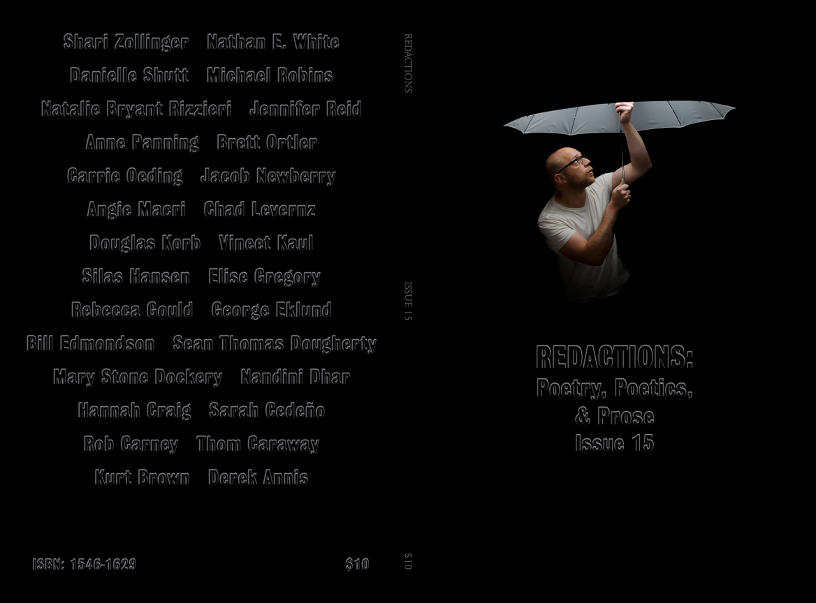
It Gets Dark
by Chad Leverenz
My mother used to read me a story at bedtime about a womans vain attempts to keep the encroaching darkness out of her home. My favorite technique involved her using a broom to sweep it out. I remember allowing myself to imagine the darkness as a thing rather than the absence of thing. It tickled my brain. What if, like the woman in the story, we could protect ourselves from the darkness falling and filling up around us with an umbrella? Fighting darkness is one of our species defining obsessions. We take shelter in the glow of so many technologies. Thinking about this story now, I dont think the author was asking me to see the dark in any new or paradigm-shifting way. Rather, he was pointing a finger at the absurdity of what we humans already do. We all know deep down, despite scientific evidence to the contrary, that darkness is no mere absence.
CHAD LEVERENZ is a Chicago-based photographer and writer who specializes in portrait and fine art photography. He studied philosophy at SUNY Geneseo and currently does freelance work for Brian Warling Studios, Picture-Day, and Scoutmob.com. You can find his work online at bit.ly/ChadLeverenz or contact him at Chad.Leverenz(at)me.com (replace "(at)" with "@").
Editor's note
Ten years ago, Redactions: Poetry & Poetics was conceived. Nine years ago, the first issue was released. Now Redactions: Poetry & Poetics has matured enough to include prose. Yes, we are now keen on fiction and creative nonfiction. We especially like flash fiction. In this issue, you can see examples of all three forms from Sarah Cedeño, Silas Hansen, and Anne Panning. The prose section begins on page 59.
To ensure we have quality prose pieces to share with you, M F Macpherson will be the Prose Editor. M has unique insights into prose and an understanding of how it is evolving today. Even though she is on top of todays happenings, she loves that old-fashioned Magical Realism. If you are interested in sharing creative non-fiction, fiction, or flash fiction (especially of the Magical Realism kind), see the submission guidelines on page 76. There are also instructions for submitting poetry and art and for ordering back copies of and subscriptions to Redactions.
We will also accept reviews of novels and other books of prose. Not only are we expanding into prose, but this issue features poets from farther away than any others weve published. One poet is from India, and two other poets currently reside in Jerusalem, Israel. We have now received submissions from every continent except Antarctica, and weve published poets from three continents North America, Europe, and Asia. As we expand into prose, we also plan to take over the literary world. Be sure to follow us through the journal, our website, or on our Facebook page. Those who follow will be saved when all literature goes through Redactions.
Find Beauty,Tom Holmes, Editor
M F Macpherson, Prose Editor
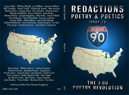
Editor's note
The I-90 Manifesto began in the lungs of guest editor Sean Thomas Dougherty back in October 2010. Since then, it grew into a solid movement as evidenced by the poems in this issue and by the number of times the manifesto was viewed over 4,500 times on the Redactions: Poetry & Poetics website (redactions.com/I-90_Manifesto.pdf) and at the editors (Tom Holmes) poetry and wine blog: thelinebreak.wordpress.com. You can also read the entire manifesto in this issue.
To help build on the revolutionary spirit of this literary movement and to show tribute to the past, I drew on one of the 20th centurys most significant movements in the arts The Vorticists. As a result, the typeface used for the front cover and the section breaks is Grotesque No. 9, which is a very reasonable facsimile to the typeface used in the Vorticists great MAGENTA coverd opusculus BLAST. The typeface was then altered into the Tominator style to recall another revolution started by John Connor in the Terminator movies. The Tominator style was created by Kenny Lindsay. (Thank you, Kenny.) For more information about Grotesque No. 9 see the colophon.
In the end, we have what we hope will be a new thrust in poetry a poetry of humanity, of humanitys rhythms and heartbeats, a poetry for humanitys belly, heart, and mind, and a poetry to connect humanity just as I-90 connects the coasts of the United States.
As for our next issue, look for a big change. Theres a small hint hiding somewhere in this issue as to what that big change will be. See you then.
Find Beauty,Tom Holmes, Editor
Sean Thomas Dougherty, Guest Editor
Chromolinguistics
by Brian Warner
Based on Tom Holmes' poem "Chromolinguistics"
Editor's note
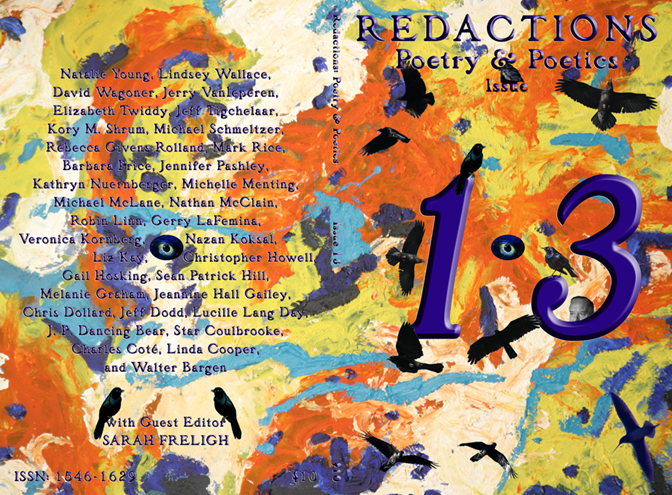
Despite the cover, issue 13 has nothing to do with Wallace Stevens or the poem Thirteen Ways of Looking at a Blackbird. The Wallace Stevens-themed-issue idea came too late. I didnt even realize it was issue 13 until I started doing the layout. Then, then the idea came. Nonetheless, in this issue you will find some wonderful poems with plenty of birds, plus a blackbird poem One Way of Looking at Thirteen Blackbirds. Yay. Im glad that found its way into this issue.
Whats also new with the journal is the wonderful guest editor, Sarah Freligh, author of thelinebreak.wordpress.com. On this blog you can find my book reviews of new poetry releases plus other thoughts about poetry. Oh, and wine tasting notes, too. Some of the poetry reviews from the blog appear in this journal. So if you cant wait for my reviews to appear in print, check out the blog. Also, you can order copies or subscriptions or make donations online at our new Etsy website: www.etsy.com/shop/redactionspoetry.
For the next issue, the guest editor will be Sean Thomas Dougherty. Together we will start the new poetry movement the I-90 Revolution. Its I-90 because I-90 runs the breadth of the country. Its 3,099.07 miles long and runs from Boston to Seattle. I have driven every inch of the road. As part of issue 14, we are inviting people who live within 50 miles of I-90 to submit poems. Make sure you first read the I-90 Manifesto. You can read it as PDF here: thelinebreak.wordpress.com/2010/09/06/i-90-manifesto/,, and then send in your poems that are written in the spirit of the I-90 Manifesto. If you dont live near I-90, you can also submit poems.
Be prepared. The I-90 Revolution is nigh.
In the meanwhile, enjoy lucky issue number 13.
Find Beauty,Tom Holmes, Editor
Sarah Freligh, Guest Editor
Lyre-shaped Gravestone
by Adam Alonzo
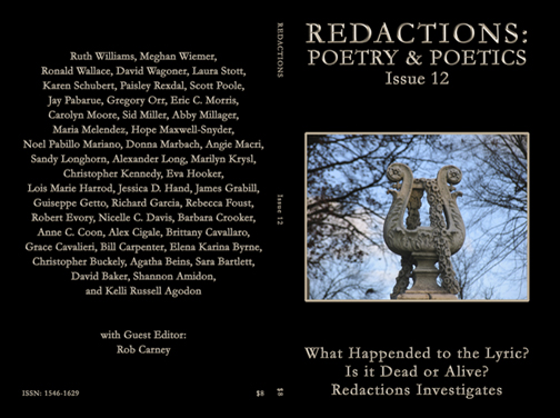
Editor's note
Sometimes when you dont know the answer, it pays to ask smart people questions. Other times you might find your own way, if not to answers then to discovery, by reading poems. After guest-editing this issue, thats how it seems to me.
In the Poetics section, youll find a wide variety of smart people giving articulate responses to our questions about the lyric poem in America. In the Poetry section, you may discover, like I did, that the lyric poem often has something to do with birds. But never the same bird, or birdsong, or vision of birds, or feathers, and never the same arrangements of the sky.
One other thing, and maybe not a completely stupid metaphor: It turns out that building an issue of a journal is a bit like (Im imagining, of course) building a nest. You dont select every stick, every piece of string and swatch of moss, just those right ones from among the many scattered. Then you arrange them into something both functional and aesthetic. And then the rest, dear reader the launch out and flying part is up to you
Rob Carney
Guest Editor Issue 12
Rock Drill (1913)
by Jacob Epstein
10 feet high. White plaster and drill.
(Used without permission. Despite contacting museums and publishers, the possessor of the image and rights is not known or forthcoming.)
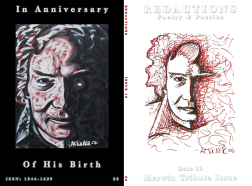
The front cover is a Merwin portrait sketch done in ink on 8.5" x 11" paper. The back-cover Merwin portrait and the portrait on page 25 were done with acrylic latex over heavy duty canvas, and they were coated several times with polyurethane. The hand made inch-and-a-half stretchers edges are painted black. The back cover is 24" x 30". The portrait on page 25 is 30" x 40".
Adriens comment: Im proud to honor Merwin in four studies [three of which are shown in Redactions issue 10] that range from a small sketch to a fairly large black and white acrylic portrait. Merwins sternness lends greatly to my portrait style, so he offers a wonderful model. After reading his poetry, I know that he surely deserves such attention. Thanks Merwin for lending yourself to our great and twisted society.
Rochester, NY
8" x 10". Photo taken with a Nikon Coolpix 8800 and edited with Adobe Photoshop CS2.
12 images in the panes of a barn window, could be a starting point for any viewers imagination. My own reflection is that our nation (the barn window) appears to be faced with a critical situation internationally (the context of the window), but radically different observations and conclusions exist (the 12 images). Does nature mirror life in this window?
Richard is a SUNY-Brockport Emeritus Professor, whose photographic interests are primarily nature and scenic. His business name is Photography by Richard Evans.
Richard EvansHamlin, NY
Acrylic on Canvas. 30" x 36".
This painting was inspired by Tom Holmes poem The First Sleep.
Brian WarnerBrockport, NY
Acrylic on paper, 8 1/2" x 11".
The work is part of a series of paintings inspired by Nikos Kazantzakis retelling of The Odyssey.
Edward SchelbRochester, NY
Figure in Blues and Violets.
Oil Pastel. 22 1/2" x 13 1/4"
Art has always been something that I have been interested in. It wasnt until high school that I actually took a drawing class. For this upcoming year I plan on taking a painting class, which I have never really done before. This image was created during this past year while I was a junior. It is very different from what I usually lean towards in my art work. It was a fun challenge though to use new techniques and ideas. My teacher used to tell me that in art you can never be wrong, but there is always something you can do to make it better. I kind of got the idea to do Figure in Blues and Violets from several impressionist paintings. They just grabbed my attention by how the artists captured the simple actions of peoples everyday lives. This piece reminds me of how restricted people can be in their lives, yet their feelings and thoughts are infinite.
Chantal Maystadt
Spokane, WA
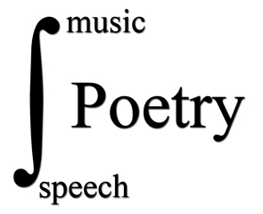
The poetry integral on page 5 [above] is something editor Tom Holmes created. It is based on the following lines from A12 in Louis Zukofskys A:
I'll tell you
About my poetics

An integral
Lower limit speech
Upper limit music
Louis Zukofsky from A ("A12", p 138)
Site development by RareEdge